
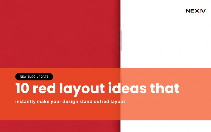
10 red layout ideas that instantly make your design stand outred layout
Most designs fail for one simple reason they don’t grab attention.
You might be using good fonts, nice images, and clean layouts… but if your design doesn’t stand out in 2–3 seconds, people scroll past it.
That’s where red layout designs come in.
Red is bold, powerful, and impossible to ignore. When used the right way, it can turn a basic design into something eye-catching and high-converting.
In this guide, you’ll learn 10 practical red layout ideas you can actually use for Pinterest, social media, or your brand.
1. Bold Red Background Layout (Instant Attention)
The Problem
Your design blends into the background.
The Solution
Use a strong red background.
How to Use It
Choose a deep red shade and add white or black text on top. This creates high contrast and makes your content pop instantly.
Mistake to Avoid
Don’t use too many colors with red it already stands out.
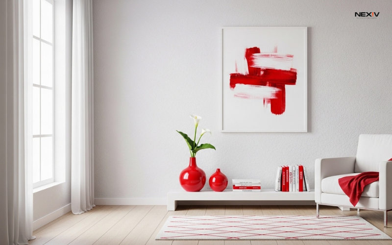
2. Red Accent Layout (Clean but Powerful
The Problem
Full red designs feel too strong.
The Solution
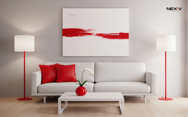
Use red as an accent color.
How to Use It
Keep your background neutral (white or beige) and use red for buttons, lines, or highlights.
Real Tip
This works great for professional or business content.
3. Red Gradient Layout (Modern Look)
The Problem
Flat colors feel outdated.
The Solution
Use red gradients.
How to Use It
Blend dark red with lighter red or pink tones for depth.
Real Tip
Gradients make your design feel more modern and premium.
4. Red and Black Layout (Strong and Bold)
The Problem
Your design lacks impact.
The Solution
Combine red with black.
How to Use It
Use black as a base and red for highlights or headings.
Real Tip
This combo works best for bold, powerful content.
5. Red Minimal Layout (Clean and Stylish)
The Problem
Too many elements make your design messy.
The Solution
Keep it minimal with red focus.
How to Use It
Use lots of white space and add one red element as the main focus.
Real Tip
Minimal designs perform very well on Pinterest.
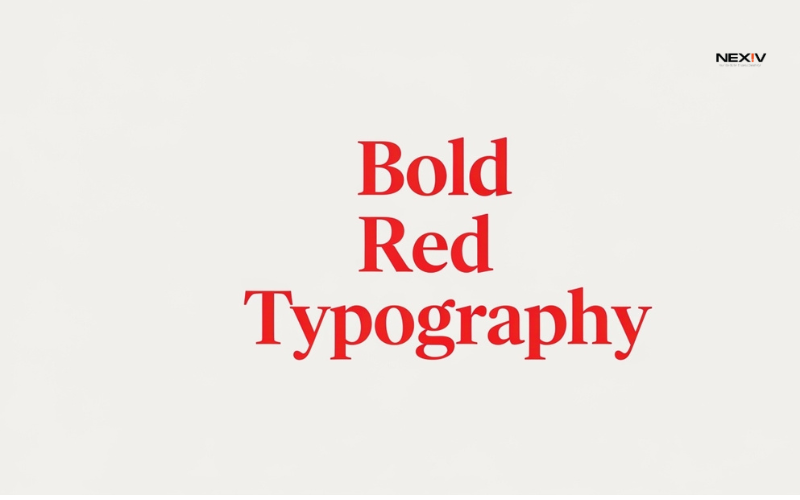
6. Red Typography Layout (Text-Focused Design)
The Problem
Your message is not clear.
The Solution
Make text the main design.
How to Use It
Use bold red fonts for headings and keep the rest simple.
Real Tip
Short, strong text works best.
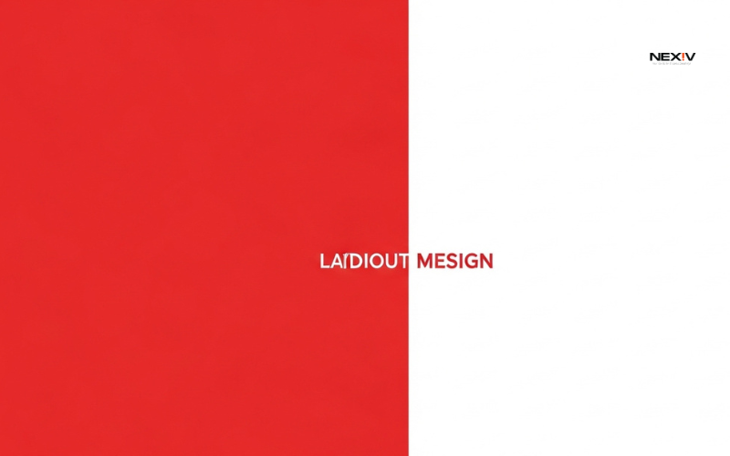
7. Red Split Layout (Balanced Design)
The Problem
Your design feels unbalanced.
The Solution
Use a split layout.
How to Use It
Divide the design into two parts—one red, one neutral.
Real Tip
This keeps things visually interesting and clean.
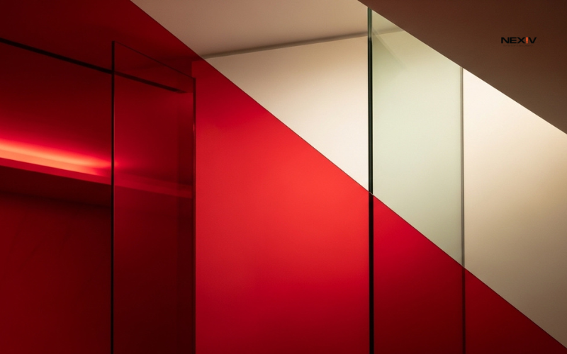
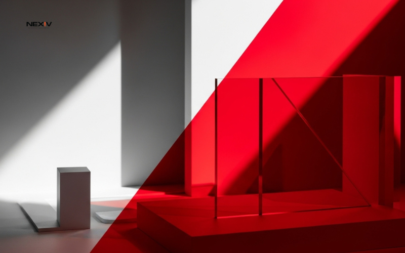
8. Red Overlay Layout (Image + Color Blend)
The Problem
Your images look plain.
The Solution
Add a red overlay.
How to Use It
Place a red transparent layer over your image for a stylish effect.
Real Tip
This makes your design look more professional.
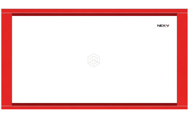
9. Red Frame Layout (Simple Highlight Trick)
The Problem
Your content doesn’t stand out.
The Solution
Use a red border or frame.
How to Use It
Add a thin red frame around your design.
Real Tip
This draws attention without overdoing it.
10. Red CTA Layout (High-Converting Design)
The Problem
People don’t click your content.
The Solution
Use red for call-to-action.
How to Use It
Add red buttons or text like “Click Here” or “Learn More.”
Real Tip
Red naturally increases urgency and action.
Conclusion: Why Red Layout Works (And How to Use It Smartly)
Red is powerful but only when used correctly.
If you:
- Keep it simple
- Use contrast
- Focus on one strong element
You’ll create designs that actually get attention and clicks.